


Hi I'm James, a senior product designer. Let’s create something positive for society
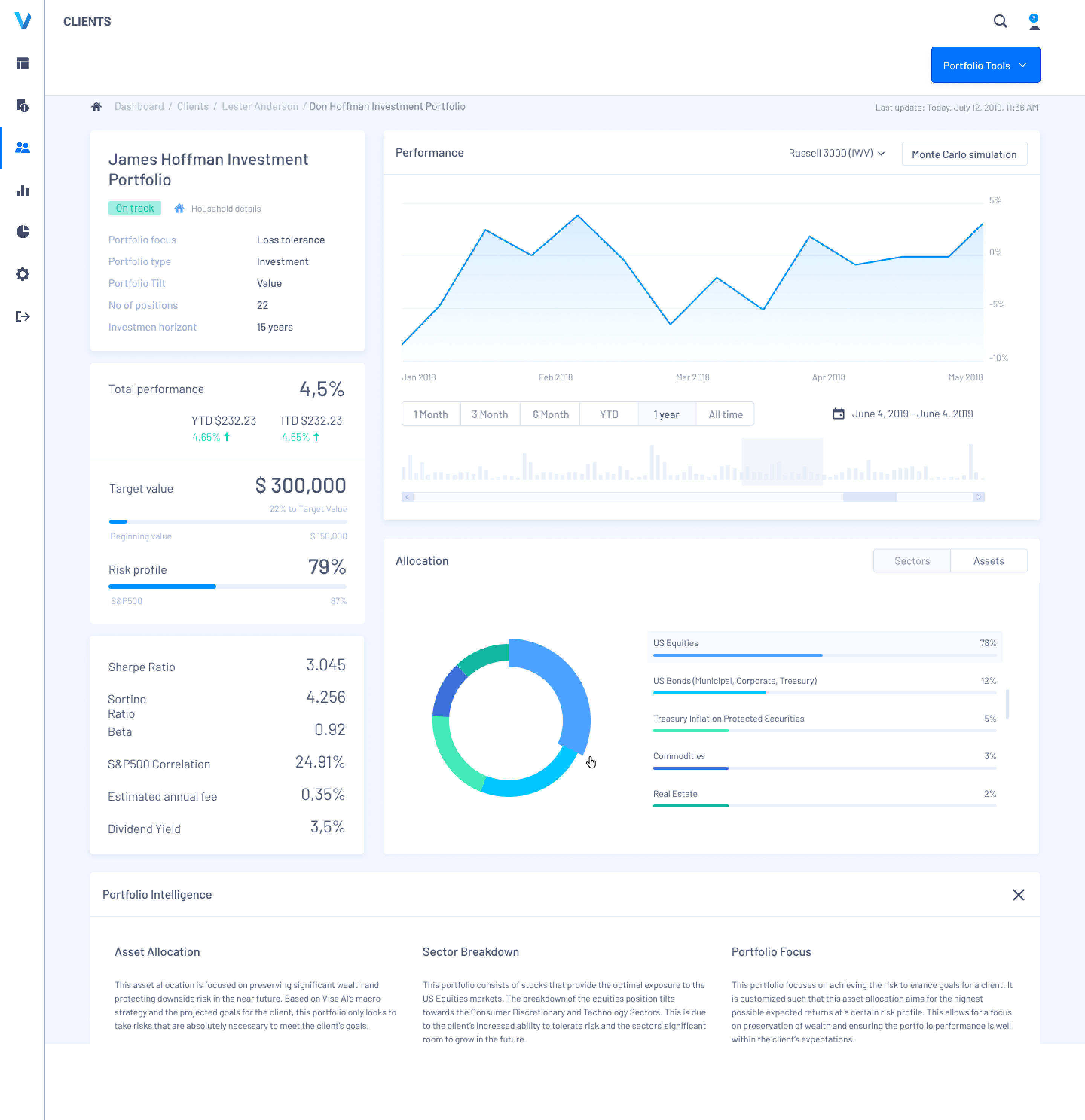
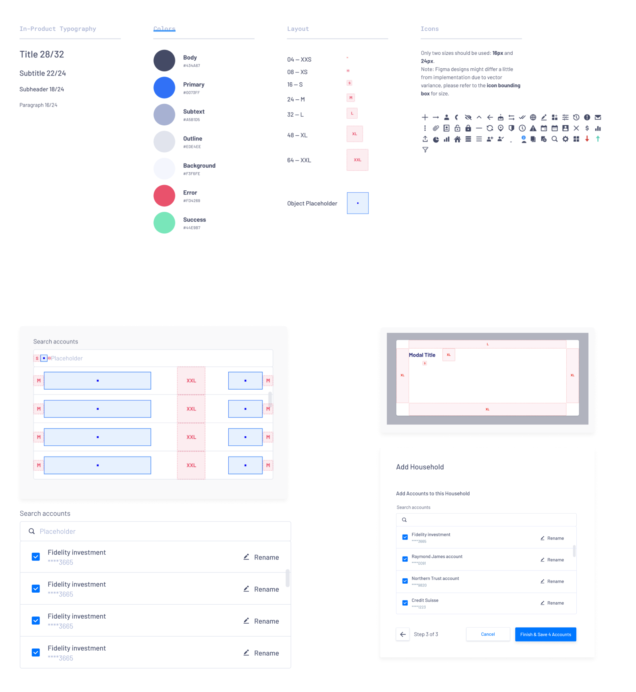
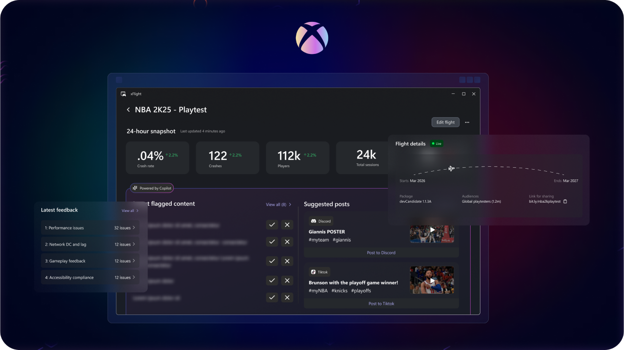
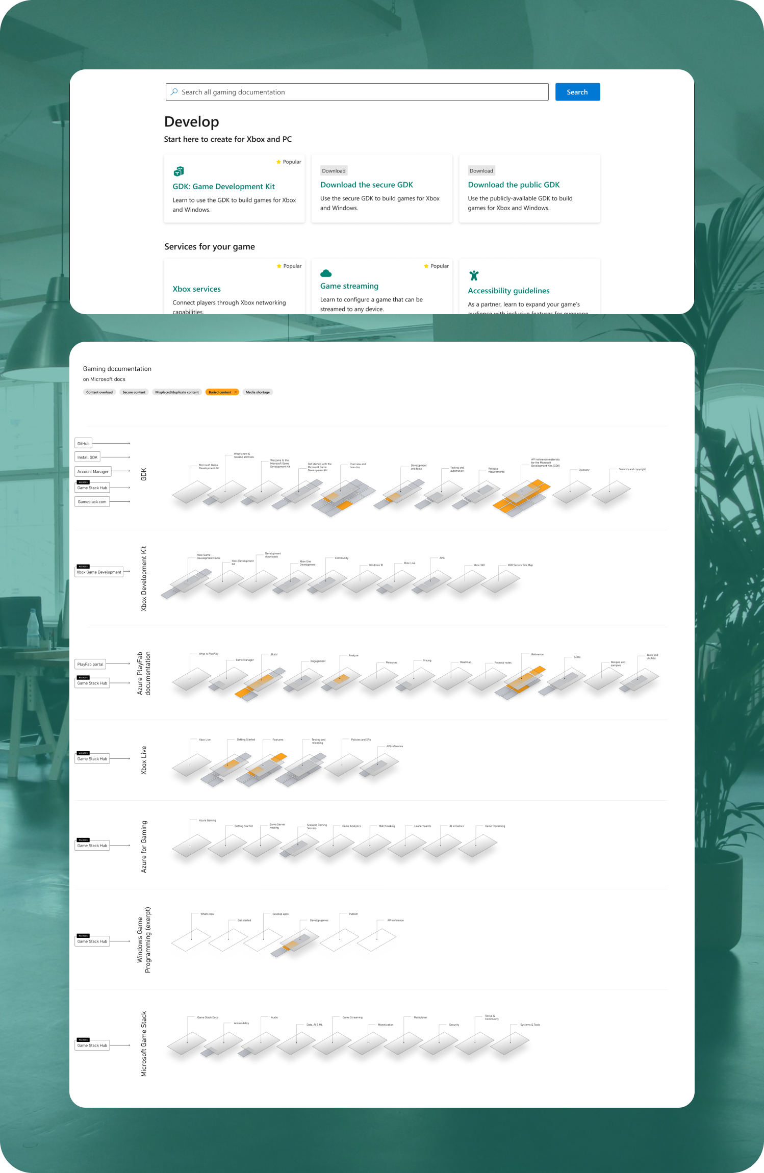
Over ten years, I’ve led design efforts at Xbox, built financial tools at Vise and Haven, dabbled in healthcare, and built products from scratch.


Other work
Created with beta software, there may be some bugs


Hi I'm James, a senior product designer. Let’s create something positive for society
Over ten years, I’ve led design efforts at Xbox, built financial tools at Vise and Haven, dabbled in healthcare, and built products from scratch.
Navigate ambiguity
I learn as much as possible while wading through often dark waters
Design for real people
I bring those learning to the light with a focus on helping users achieve a goal
Have an impact
I collab internally to hit goals that keep the business running

Other work
Created with beta software, there may be some bugs