Vise is a fintech company that uses A.I. to automate a lot of manual tasks that financial advisors do on a regular basis. So things like building scenario-based portfolios, providing suggestions with real-time portfolio and market monitoring etc.
My goal for this feature was to take an idea from 20% to 100% and ready to ship. I worked closely with the PM, primary engineer and compliance officer to bring this to life.
Tax-loss harvesting is basically a strategy to reduce the amount of short term gains on securities (because they're taxed at a high rate). Advisors do that by selling off other securities at a loss. Robo-advisors like Vise, Wealthfront, Betterment etc. employ this strategy automatically. But, in our case, we also needed to grant advisors the ability to do it manually for their clients.
Why? Well, Vise is a fairly new piece of software and taking into consideration who our primary users were (45+, 30% retiring soon) and their level of familiarity and trust in A.I., we wanted to make this available and accessible for them. After some discussion about how to show inputs and outputs, we landed on a slider, a highly-interactive pattern we used in the past.
Initial sketch
Version 1-3:
At first, I questioned separating the input and output. There were so many dynamic elements on the screen I thought placing the input and output in different areas could be confusing. So my first few revs were focused on removing or downplaying the table as an output.
Feedback
The idea to bring input and output together was well-recieved visually. Though, there were too many dynamic elements to simplify the design that much. It actually made things more complex than they needed to be.
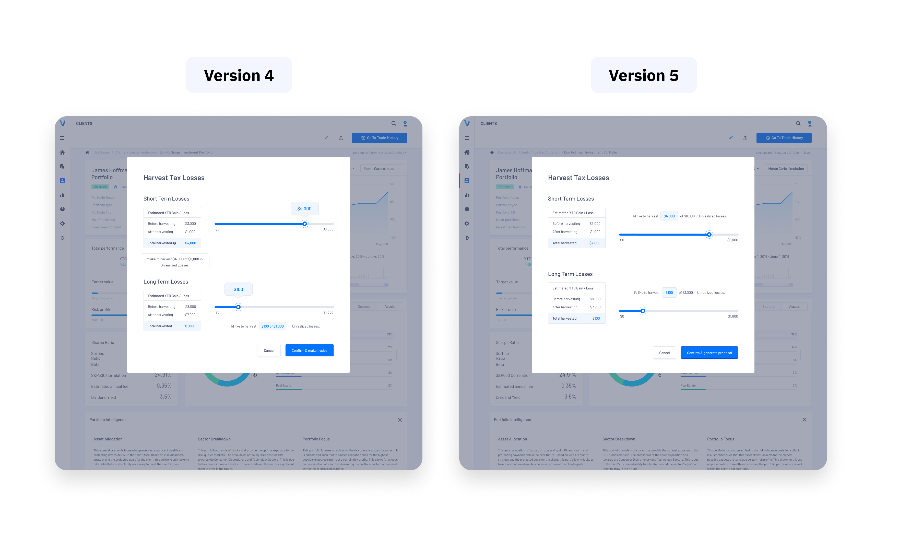
Version 4-5:
What I tried to do was create a 1:1 relationship between input and output. So, making it really clear what's changing as you're moving the slider. In v4, I introduced a written output that helped to remove some ambiguity.
Feedback
Version 4 ended up shipping. Writing out exactly what was changing and aligning the input/output colors made it super clear to advisors what was changing as they changed the slider.
I was able to use, then extend an existing pattern to design this product feature. It would have been interesting to explore some different types of inputs, though there has been a lot of engagement with sliders in the past and given that we are looking for a specific range I think it worked.