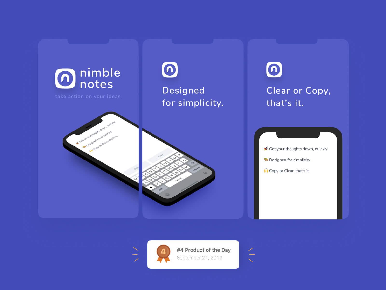
I was on the train on the way home. I had a I live in NYC and life is often a frantic scramble from one thing to the next. There’s hardly a moment to yourself to think, let alone organize your thoughts. And my thoughts and ideas kept getting lost in the shuffle. I needed some way to get those things “down on paper” that I could take action on later in the day when I have more time.
Tools used:

After the problem presented itself, I did some brainstorming on the name. Gotta be able to market it. It has to sound nice. I’m a former writer, so visual design, for me, stems from identifying keywords that describe the vibe I’m looking for. I wanted something smooth, seamless and exuded “quick”. Alliteration is always good, makes it memorable.
Nimble = quick, fast, agile, swift.
Ah, Nimble Note (“Note” was taken, so I had to make it plural). It was punchy and easy to remember.
Purple (#545CC5), a darker purple (#434DBA) and some lighter grays
Once the name was settled, the main color was fairly simple (I tend to stick with one or two colors when possible), I initially thought a red or orange color with a lightning bolt with a pen or notebook was going to work, but it ended up being too harsh, too on the nose and too complicated. The purple was right in the sweet spot of being tech-y but not too tech-y. And it just feels good. This is my product, I can do what I want.
the alternate (for marketing) and the original
I like things that are simple and seamless. A modified “N” did the trick. I haven’t gotten used to the Pen tool in Figma so I hopped over to Sketch to handle the logo (I have no idea how to use Illustrator, tbh). I think design needs to be friendly and accessible. We’re too precious with our work at times. It will hardly ever turn out exactly the way you design, sometimes you have to be happy with how something turns out and be proud of the work you put out into the world.
I’ve been a real fan of Nunito (Google font) lately. It’s friendly, open and just darn fun. I couldn’t resist. And drop shadows.
😋mmmmm do I love a good drop shadow.
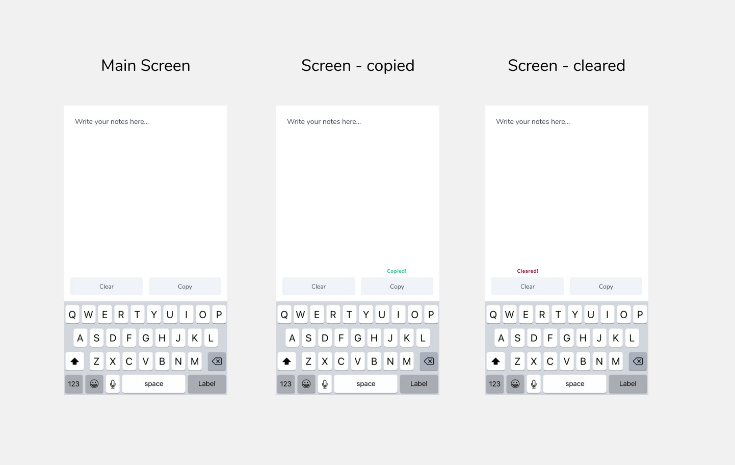
The interactions were easy. I knew I wanted users to take action on their ideas. Not let them languish in Note App Exile. With that in mind, it was clear what I had to do. Copy and Clear. Green and Red. Take Action, or not. These are the screens I sent the developer. I’m sure he was confused at such a simple app, but whatever.

With that, I used a 3D iphone mockup template in Figma to produce the app screenshots.

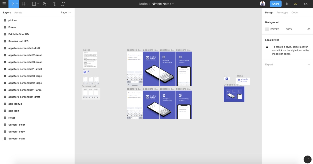
And here's my Figma file for good measure
