Clearfind is a B2B platform that uses A.I. to suggest a tailored suite of software (or Vendors) for other companies (Buyers).
A "Vendor" is a company like Mailchimp, who would come to Clearfind for qualified leads to new customers (Buyers) looking for email outreach solutions.
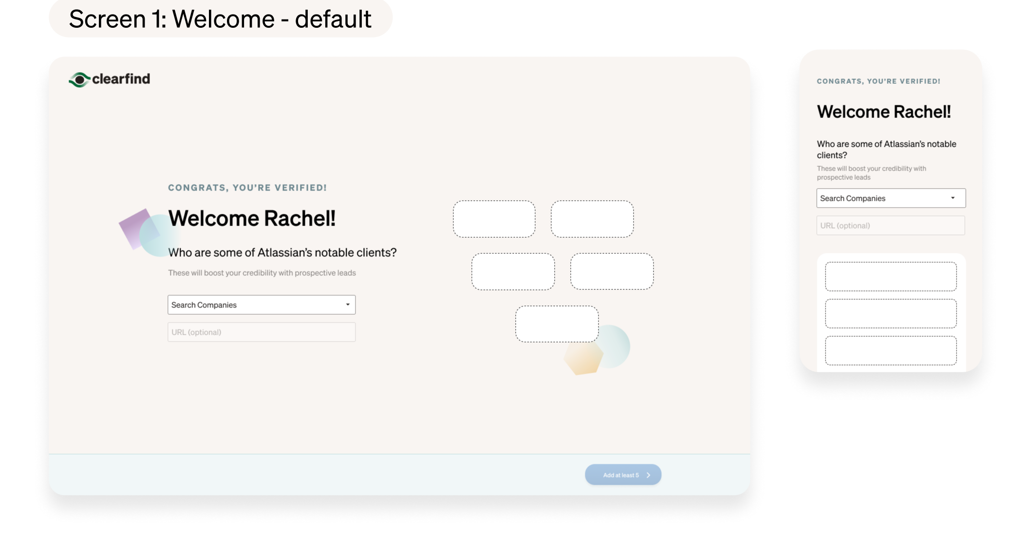
My goal was to design an engaging, simply-designed signup flow for Vendors coming onto the platform. Clearfind needed to gather personal and payment information so making it seamless was crucial.
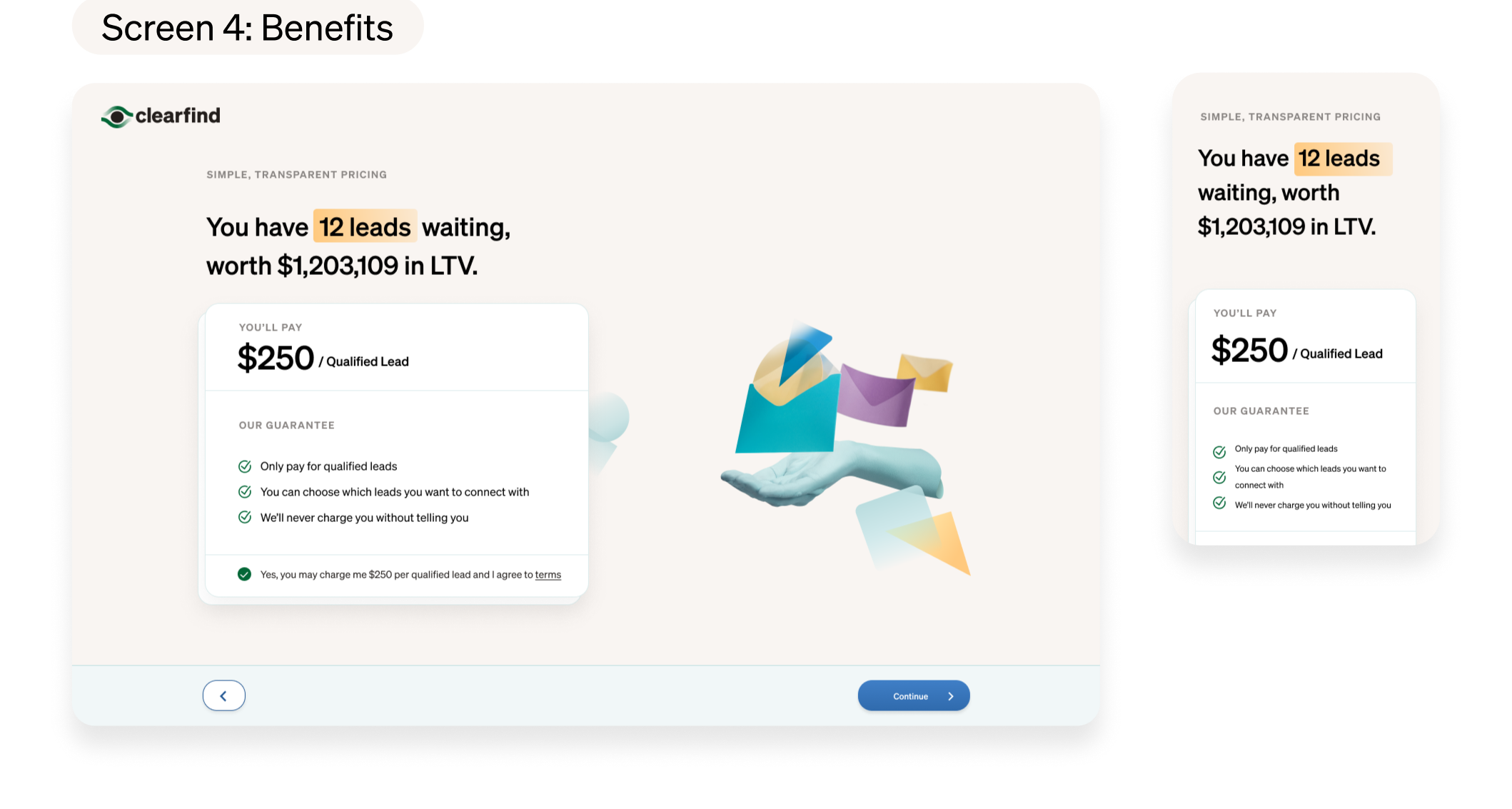
(I'll be using the Pricing screen to illustrate how I iterated on visuals)
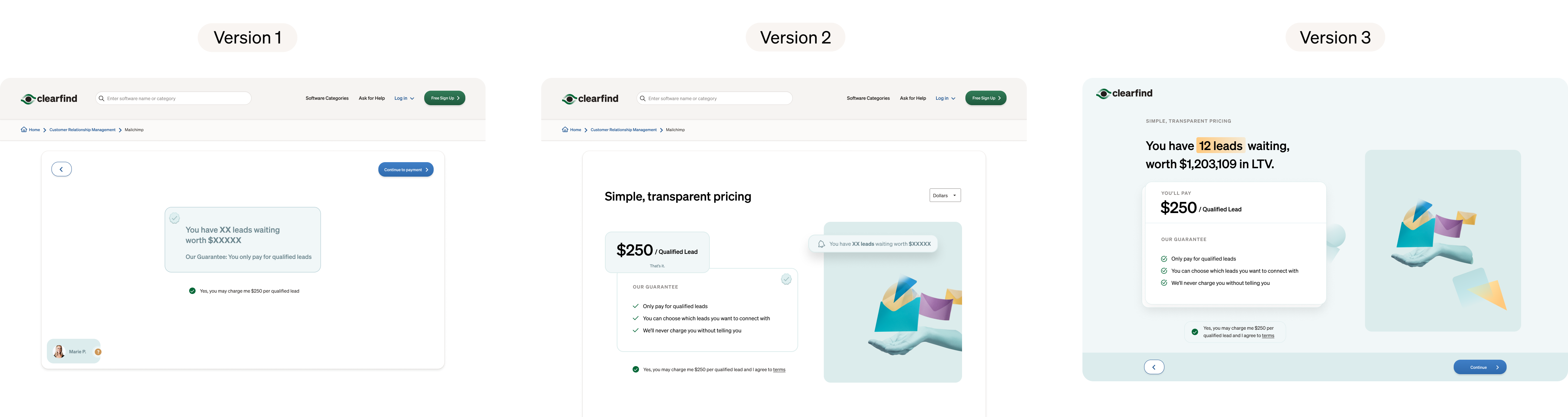
Version 1:
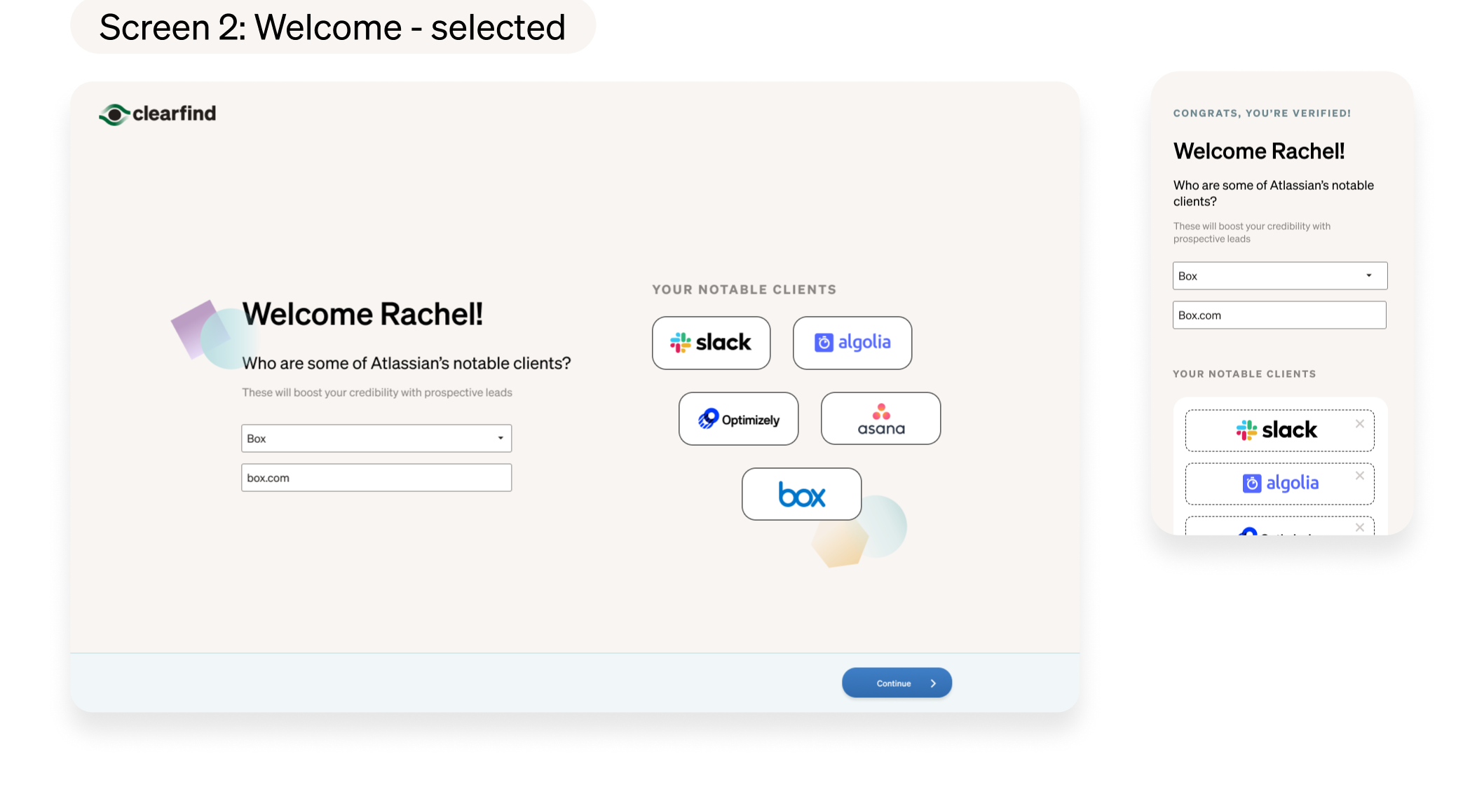
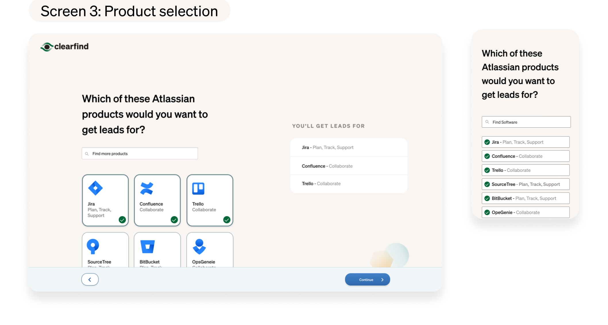
I followed some already-established patterns of the Buyer signup.
Feedback
My original goal was a little off. Vendors were a little different -- they bring in more money than Buyers. So the experience needed to be more engaging, as this is a make-or-break moment in the flow.
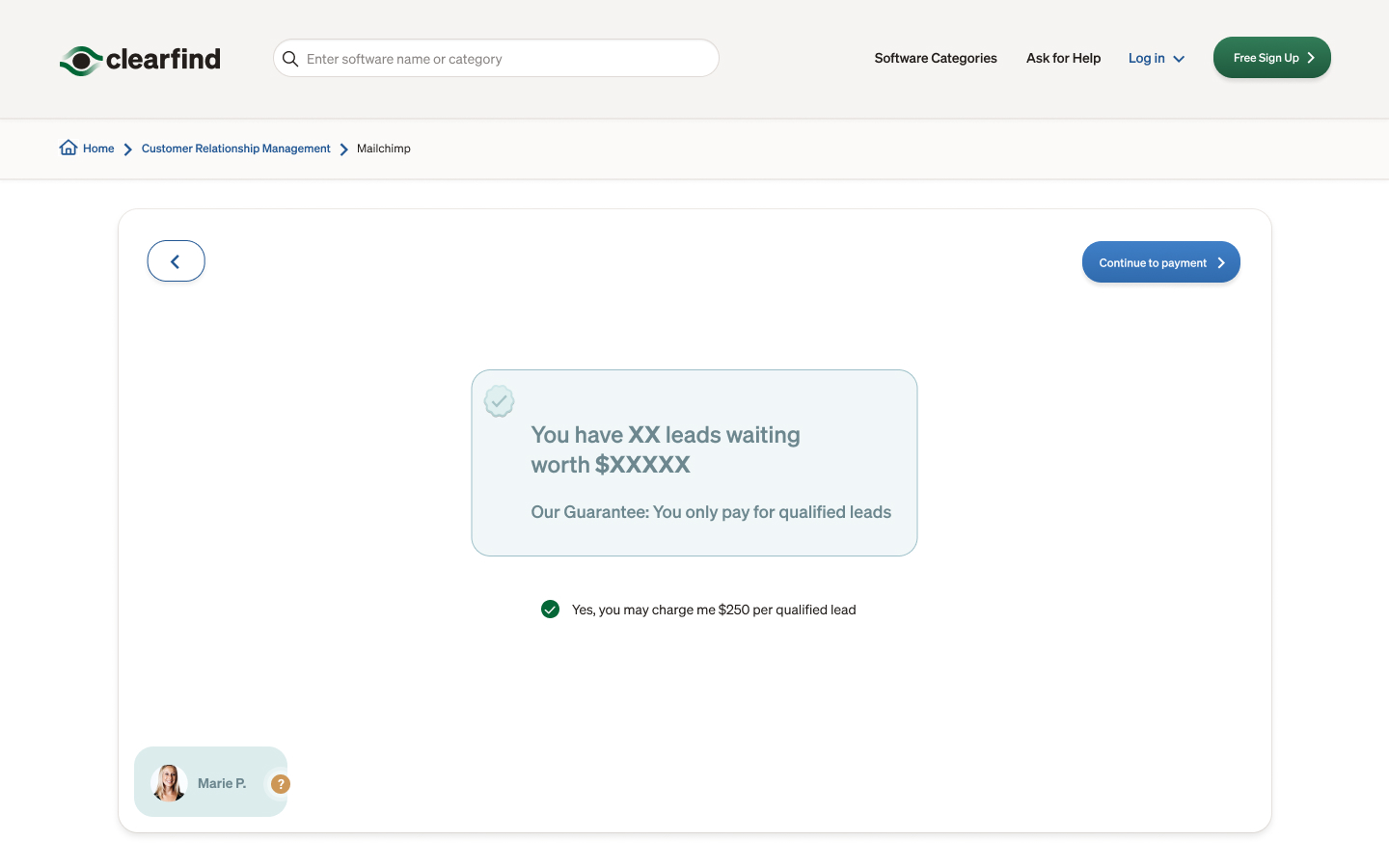
Pricing screen: Version 1
Version 2:
Made it a little more visually engaging, adding in some illustrations we had on the marketing site and some offset elements. I also added in the benefits to remind Vendors why they're signing up since we're asking for money in the next step.
Feedback
It was more engaging but there were too many things going on and pulled their attention in too many directions. It needed to be more focused and the benefits emphasized more.
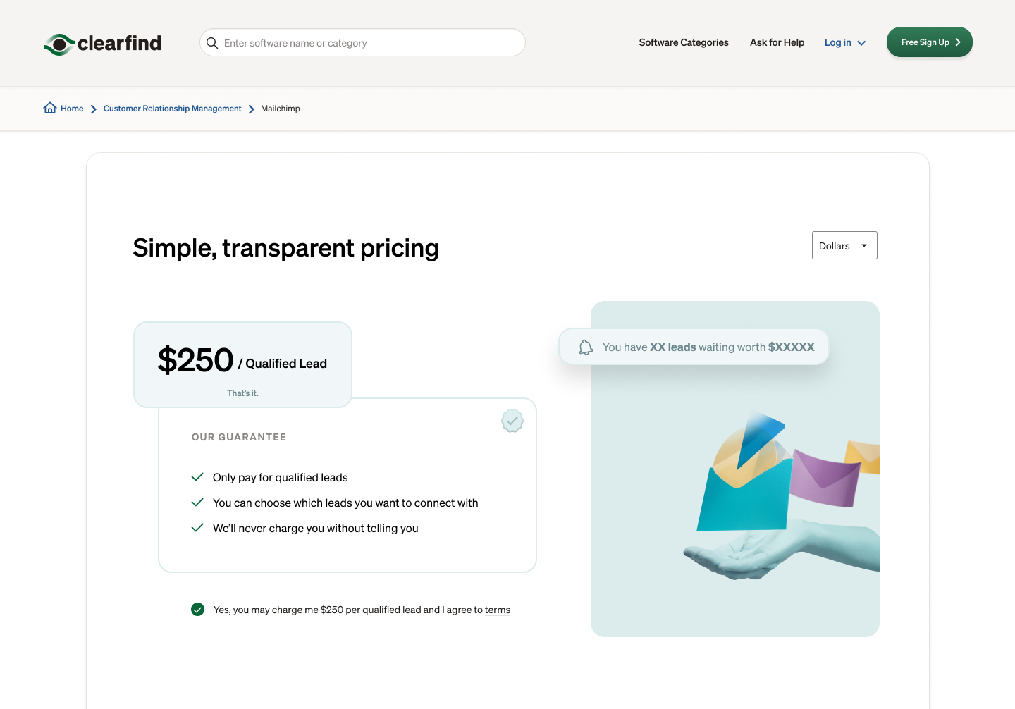
Pricing screen: Version 2
Version 3:
In addition to the white version I tried a green version of the flow that we were using on parts of the marketing site. I used the header to emphasize the real value -- the # of leads and their lifetime value -- to further entice them to sign up. I also brought in a card pattern from the Buyer flow and improved the typography.
Feedback
Visually it works, but the marketing site had changed a bit and the green had been de-emphasized.
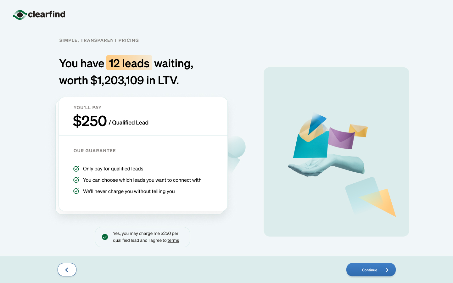
Pricing screen: Version 3
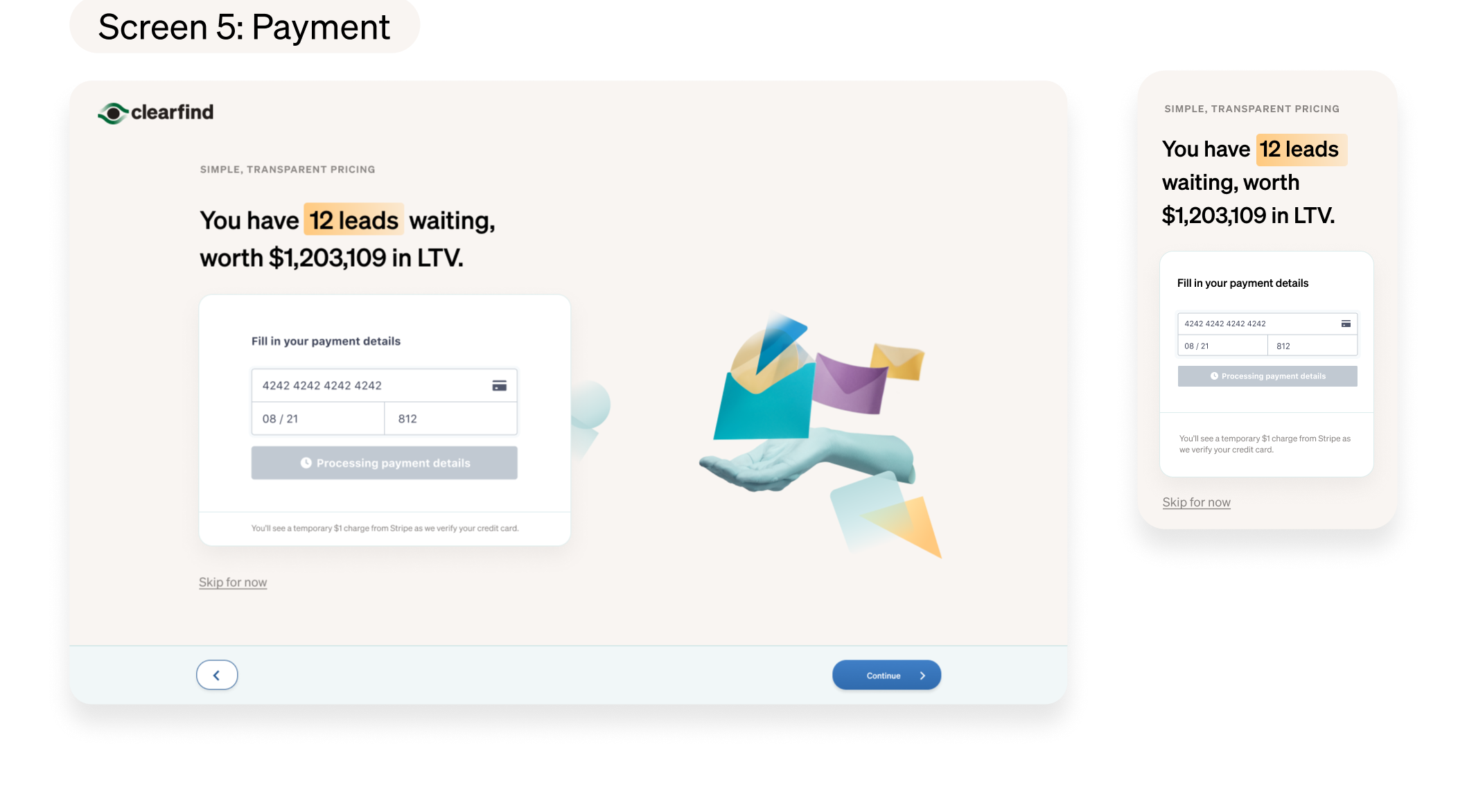
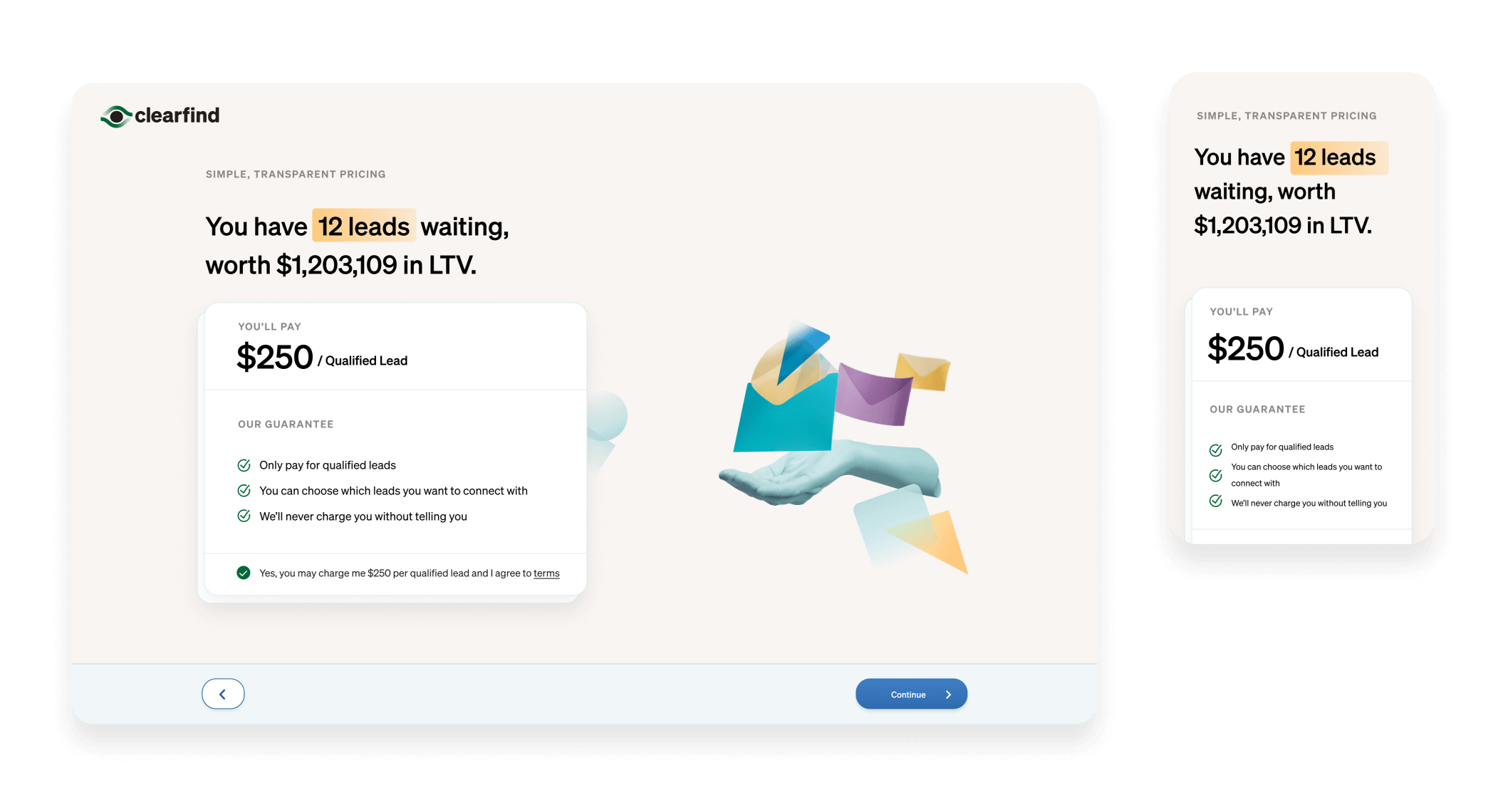
Version 4 - final:
We landed on a tan version. Made some visual improvements like aligning the checkbox and the checklist of benefits and pulling it into the card to de-emphasize.